Blog
Vintage Rangers Kits That Influenced Modern Football Fashion
Rangers are somewhat of an anomaly in football kit history. Their commitment to a consistent visual identity, royal blue, white, and red, for over a century, has resulted in an archive that is greatly appreciated by not only collectors but also the fashion-savvy fans. Under the same umbrella, some designs from different times not only got a mere nod from the public but also influenced the style of the football kit and how it was worn all over the football world, not just Ibrox.
The club’s dominance on the field throughout the 1990s, along with a number of really distinctive kit designs held in that decade, led to the placing of Rangers shirts at the very center of a time when football fashion and popular culture, in general, continued to merge in a new and interesting way. That blue shirt which the team wore in the nine, in, a, row season was not only a winning football garment but was elevated to a cultural artifact loaded with significance by a wide range of people, both in Scotland and further afield.
The Umbro Foundation Years
Rangers’ partnershipwith Umbro for most of the 1970s and 1980s led to the production of shirt pictures that were the visual language the club’s later designs would develop. The neatly kept bluewith red and white trim that Umbro handed over to the club during this time reflected the kit manufacturer’s steady philosophy of making kits that clearly communicate the club identity without any unnecessary visual complexity.
The 1972 EuropeanCup Winners’ Cup shirts occupy a very special place in Rangers’ design history. The clean Umbro home design worn during that Barcelona triumph carries the weight of the club’s most significant European achievement, and genuine pieces from that era have become genuinely scarce collector items. The design is straightforward, so its appeal is mainly based on historical significance, but a well-done simplicity undoubtedly lasts longer than a badly done complexity.
The Nine-in-a-Row Era and Design Influence
The era from 1988 to 1997, in which Rangers racked up nine straight Scottish Premier Division titles, was marked by some of the most visually striking kit designs in the history of the club. The fusion of continued success and a wider cultural moment when football shirts were becoming a part of mainstream fashion gave these designs an extraordinary impact. The Adidas era, which covered most of this decade, gave the manufacturer’s particular design language to the Rangers’ already well-known identity with different levels of success from season to season. The Adidas designs at the turn of the 80s and 90s featured the graphic experimentation that was typical of the manufacturer’s work across their entire football portfolio, but applied to Rangers’ blue with the results reflecting the era’s confidence in visual complexity.
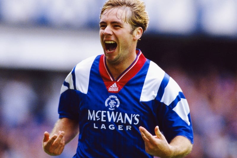
The 1992, 94 McEwan’s Lager period shirts are the epitome of a very precise moment in Rangers’ design history and acertain segment of the club’s supporters, mostly the ones who have lived through it, react with instant recognition. The secret patterns within the blue fabric, the particular collar structure, and the manner in which the sponsor and manufacturer branding merged with the club’s visual identity all led to the making of the shirts that were very much of their time. They encapsulated the early 1990s football look with a high degree of precision.
The influence these designs had on how football shirts were worn and perceived extended beyond supporter communities. When the most successful club in Scottish football was wearing bold, graphically confident designs during a period when the sport’s cultural profile was expanding rapidly, those shirts became reference points that designers working across different contexts absorbed and referenced. The retro style that these kits established continues to influence how Rangers’ visual identity is understood and recreated today.
Why Rangers’ Shirt History Matters Beyond Club Boundaries
Rangers’ kit archive matters to football fashion history for reasons that go beyond just supporter loyalty or the competitive history of Scottish football. The club’s consistent visual identity for over a century gives us a very complete case study of how strong design constraints can allow for variation and evolution within a framework that is always recognizable.
The designs from the nine, in, a, row era really encapsulated a cultural moment when Scottish football’s importance in European competitions and football’s global cultural explosion were going hand in hand to give club shirts a level of visibility they had never had before. The shirts from that time period became visible to audiences far beyond those that previous Rangers kits had reached, and so they establish visual associations that the global collector market still expresses through the continuous demand for pieces from those seasons.

5 Retirement Planning Secrets Most People Learn Too Late

5 Holistic Practices to Help You Manage Body Pain

Protecting Mailboxes from Theft with Cam Locks: A Simple but Effective Upgrade

Keep Your Equipment Safe with 5 Practical Truck Upgrades

5 Tips for Improving Safety During Aircraft Servicing

Why a Door Key Lock is Still Reliable for Small Businesses

How To Prepare for Harvest Surge Without Burning Out Your Team

Quiet Luxury vs. Loud Poverty: How the Top 1% Actually Live

The “Post and Pray” Era is Dead: The 3-Step AI Workflow for Lean Brands to Dominate TikTok in 2026

From Moodboards to Motion: How AI Video Drafting Is Evolving
5 Retirement Planning Secrets Most People Learn Too Late
5 Holistic Practices to Help You Manage Body Pain
Protecting Mailboxes from Theft with Cam Locks: A Simple but Effective Upgrade
Keep Your Equipment Safe with 5 Practical Truck Upgrades
5 Tips for Improving Safety During Aircraft Servicing
Why a Door Key Lock is Still Reliable for Small Businesses
How To Prepare for Harvest Surge Without Burning Out Your Team
Quiet Luxury vs. Loud Poverty: How the Top 1% Actually Live
The “Post and Pray” Era is Dead: The 3-Step AI Workflow for Lean Brands to Dominate TikTok in 2026
From Moodboards to Motion: How AI Video Drafting Is Evolving

The Private World of Marina Pearl LeBlanc, Matt LeBlanc’s Only Child

What is Shoujo Ramune? The Comprehensive Guide

Who is Amra Nor Jenkins? The Untold Story About Jeezy’s Daughter

Who is Christina Erika Carandini Lee? Everything About Christopher Lee’s Daughter

The Untold Truth of William Mapel: A Deep Dive into His Personal Life

The Untold Story of Denika Kisty: Her Family, Net Worth, and More

The Rise of Ryan Nikolaos Sampras: From Humble Beginnings to Stardom

Who is Nicoletta Ruhl? Age, Family, Bio

Who Is Stephanie Sarkisian? All You Need To Know AboutSteve Sarkisian’s Ex-Wife

Who Is Caden Crain? A Closer Look at Stormy Daniels’ Child
-
 Celebrity1 year ago
The Private World of Marina Pearl LeBlanc, Matt LeBlanc’s Only Child
-
 Entertainment1 year ago
What is Shoujo Ramune? The Comprehensive Guide
-
 Life Style1 year ago
Who is Amra Nor Jenkins? The Untold Story About Jeezy’s Daughter
-
 Celebrity2 years ago
Who is Christina Erika Carandini Lee? Everything About Christopher Lee’s Daughter
-
 Celebrity2 years ago
The Untold Truth of William Mapel: A Deep Dive into His Personal Life
-
 Celebrity2 years ago
The Untold Story of Denika Kisty: Her Family, Net Worth, and More
-
 Celebrity2 years ago
The Rise of Ryan Nikolaos Sampras: From Humble Beginnings to Stardom
-
 Life Style1 year ago
Who is Nicoletta Ruhl? Age, Family, Bio